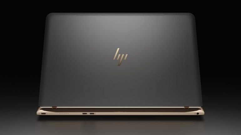
Yesterday HP introduced the Spectre, which the company claims is the world’s thinnest notebook, at least for now. The new laptop is undoubtedly a very nice device but along with it HP has made a major change – the company has introduced a brand new logo.
The new HP sign comes out of a redesign project that was started back in year 2011 but never finished. Apparently HP has gotten its act together so the end result is the new logo, which is very different from the old one. It comes with a very minimalist design that includes four lines with different lengths that are situated in such a way as to read “HP”. You will not get to see the new logo everywhere, though – HP will keep it only for its premium class notebooks.
What do you think of the new HP logo? As to us – we like it.
Source: Nextpowerup.com

